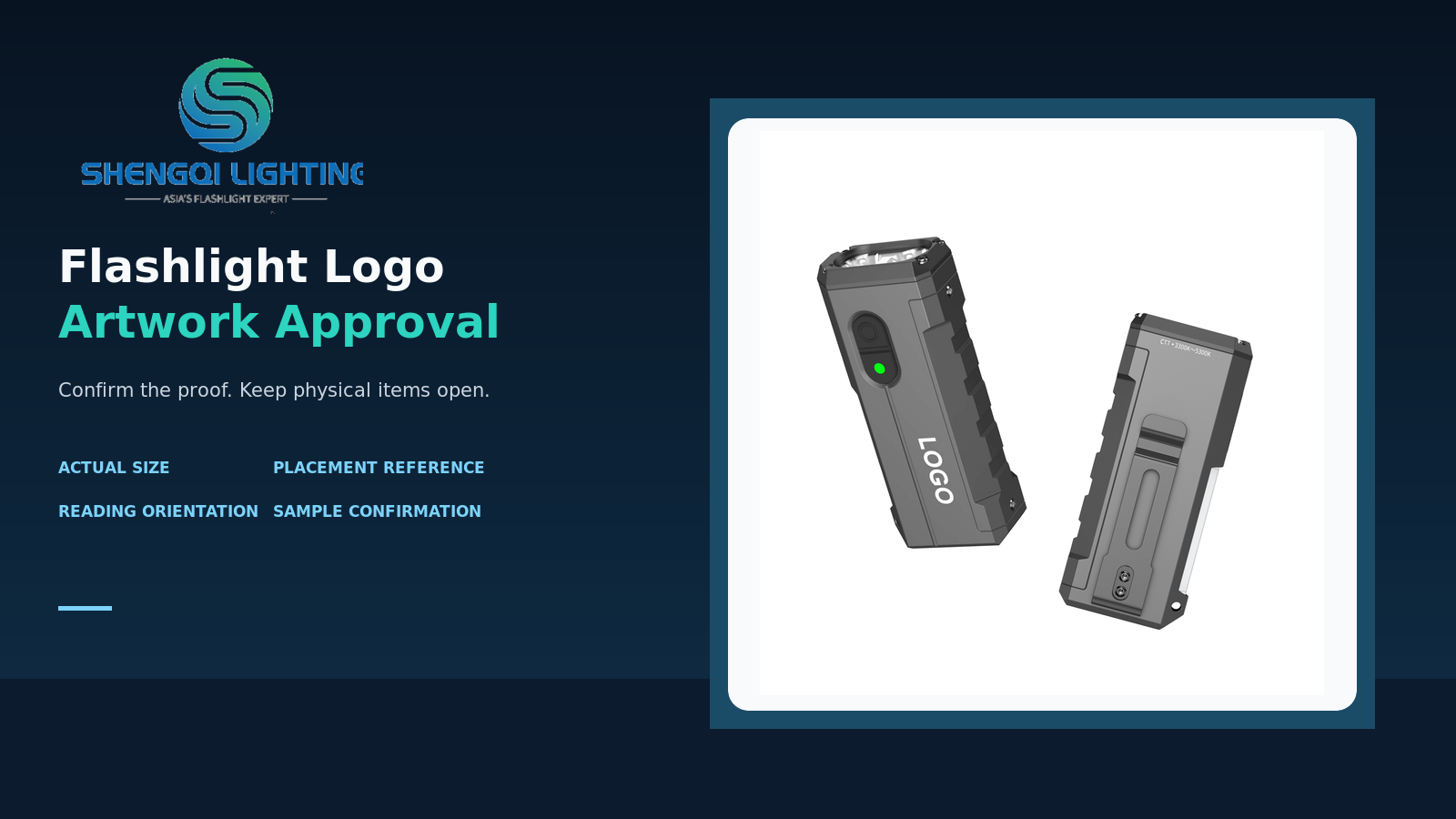
A logo can look sharp on a large screen and still become difficult to read, partly hidden by a clip, or visually unbalanced when it reaches the real flashlight body. This is a common approval risk, not a claim about any specific customer project.
Approving flashlight logo artwork means confirming the correct artwork revision, true size, placement reference, reading orientation, housing surface and marking approach. It also means separating what a layout proof can confirm from what still needs a physical sample or additional production information.
What Does a Flashlight Logo Proof Actually Approve?
A digital proof is useful because it makes a proposed layout visible before production. It can show the artwork revision, the intended logo location, approximate scale and visual relationship to visible features on the housing. That is valuable, but it is not the same as approving every aspect of the final product.
Treat approval as a set of separate decisions. A buyer may approve the layout while keeping physical appearance open for sample confirmation. A team may approve the logo graphic but still need to confirm which side of the product should face outward when clipped, displayed in packaging or held in normal use.
A clear approval record should state both what has been approved and what remains open. Approval of position does not automatically approve surface appearance, functional performance or all future production details.
This distinction prevents a visual confirmation from being interpreted as a broader production acceptance than the reviewer intended. It is especially important when the same artwork may appear on more than one housing colour, body shape or product platform.
Confirm Size, Placement and Orientation Together
Actual size is not the same as screen size
A logo enlarged to fill a monitor can make fine letters appear easy to read. The real decision is whether its specified width and height remain appropriate on the physical product at normal viewing distance. The artwork should therefore show dimensions and units, while the reviewer considers the intended use rather than relying on a zoomed-in screen view. There is no universal logo size that suits every flashlight body, logo shape or target user.
“Centred” needs a reference
The word centred is incomplete unless it says centred relative to what. It might mean centred on one flat panel, centred between two visible structural features, aligned to a clip edge, or positioned from a defined end of the housing. The usable marking area may be much smaller than the overall product silhouette. A proof should identify the reference face or feature, not rely on a general impression.
Check orientation in the states that matter
A logo can be upright when a body lies flat and appear inverted when someone holds it, carries it or shows it in a retail pack. Choose only the relevant states for the product under review. For a platform with a clip, consider whether the clip blocks the mark or changes which side is normally visible. For a product without that feature, do not add the question simply because another flashlight has one.
Artwork Files and Surface Appearance Need Different Checks
Start with a clearly identified artwork revision. An editable source graphic is often helpful when an adjustment is needed, but a filename or extension alone does not prove that the content is ready for reproduction. The reviewer still needs to inspect the actual letterforms, spacing, fine elements and intended size. A simplified version of a logo may be more appropriate for a small marking area, but that is a brand decision to make deliberately rather than an automatic production change.
A layout visualisation can support a useful discussion about location and scale. It cannot, by itself, establish the final contrast on a particular housing colour, the visual effect across a curved or textured area, the feel of a surface, adhesion or long-term wear. Those are physical questions. If they matter to the launch decision, keep them listed as sample-confirmation items instead of assuming that a digital rendering has answered them.
The requested marking method should be named in the approval brief when it is known. However, the approval should not turn a broad method label into unsupported claims about every material or design. The right conclusion is practical: confirm the appearance required for the particular product, finish and artwork at hand.
Flashlight Logo Artwork Approval Checklist
| Approval item | What to specify | How to verify it | What the proof alone cannot establish |
|---|---|---|---|
| Artwork revision | Filename, revision date and the graphic to be used | Compare the supplied source with the proof | Whether fine detail will look right on the real surface |
| Logo dimensions | Width, height and unit of measurement | Review at the stated physical size | Comfortable readability in every real use condition |
| Placement reference | Reference face, edge or visible structural feature | Check the stated reference on the layout | All real-world visual obstructions or handling effects |
| Reading orientation | The intended upright direction in relevant use or display states | Review held, carried or packaged orientation as applicable | A universal orientation for every possible user state |
| Surface appearance | Housing colour, finish, relevant curve or texture, and requested marking approach | Use the proof for layout, then review a physical sample if appearance is critical | Final contrast, feel, adhesion or wear behaviour |
| Approval scope | Approved items, open items and who records the decision | Confirm the written record matches the intended decision | Functional, performance or broader production acceptance |
A Short Artwork Approval Brief to Copy and Use
This is a suggested discussion template, not a SHENGQI LIGHTING internal procedure or a production report. Its purpose is to make the decision visible before one unclear assumption is repeated across a larger production run.
Artwork Approval Brief
Product model or housing reference: ____________________
Housing finish and colour: ____________________
Artwork filename and revision: ____________________
Logo dimensions: ____________________
Placement reference: ____________________
Reading orientation: ____________________
Requested marking method: ____________________
Physical appearance items to confirm: ____________________
Approval scope and open items: ____________________
Example only
A brief might state: “Artwork revision BrandMark_R03; logo width 18 mm; centred on the named side panel between the two indicated edges; upright when the light is held in its normal forward-use direction.”
The same brief could then state: “Layout approved. Final visual appearance on the stated dark housing finish remains for physical sample confirmation.”
The dimensions, filename and product description above are illustrative only. They do not represent a SHENGQI product specification or a customer order.
Use the Right Evidence at the Right Stage
A layout proof and a physical sample serve different purposes. The proof helps the brand team decide whether the correct artwork is in the intended location at the intended scale. A physical sample helps the team assess questions that depend on the actual body, surface and viewing condition. Neither should be treated as a substitute for the other when the decision requires both.
This is also where a clear approval note adds value. If a reviewer has approved only the location and reading direction, record exactly that. If a visual effect remains open, name it as an open item. Doing so makes the next discussion more efficient and avoids treating an unanswered question as an approved one.
For custom flashlight development, a visible logo should work with the product’s physical design rather than fight it. Body geometry, controls, clips and intended display states can all influence whether a proposed mark feels deliberate. That is the practical side of a technology-led product identity: the visual decision is grounded in how the object is actually used and shown.
Frequently Asked Questions
Can a digital proof replace a physical sample?
No. A digital proof can be sufficient for an artwork revision, stated dimensions, layout and intended orientation. It does not by itself confirm the final physical appearance of the mark on a specific housing surface.
What does “centred” mean on a flashlight body?
It should mean centred relative to an identified face, edge or structural reference. A statement such as “centred on the visible side panel” is more useful when the panel or boundaries are shown on the layout.
Does approving logo placement approve the final surface appearance?
Not automatically. A placement approval can confirm where a logo should go. Surface appearance may still depend on the selected housing finish, artwork detail and marking approach, so it should be recorded separately when it needs physical confirmation.
What should I send before discussing flashlight logo placement?
Send the product model or housing reference, the latest logo file, the intended housing colour or finish, the side or use state that matters most, and any particular appearance question you need resolved. That gives the discussion a practical starting point.
Discuss Your Flashlight Branding Requirements
If you are developing a private-label flashlight, share the model or housing reference, logo artwork, housing colour and the direction in which you want the brand to read. SHENGQI LIGHTING can then discuss the proposed layout and the next confirmation items in the context of the selected product.
For broader product-development context, review SHENGQI LIGHTING services, the company’s manufacturing capabilities, or the EDC flashlight range.
Discuss Your Flashlight Branding RequirementsYou may also email sales@shengqilight.com.